Hi traders!
In today’s FXGlobe market analysis, we’re focusing on the daily charts that could display promising bullish candles by the day’s end, particularly when they form on top of identifiable price levels, market structure, Fibonacci levels, pivot levels, and/or upwards sloping trendlines. This information will be especially valuable to higher-timeframe traders, as it offers insights into potential market moves in the near future.
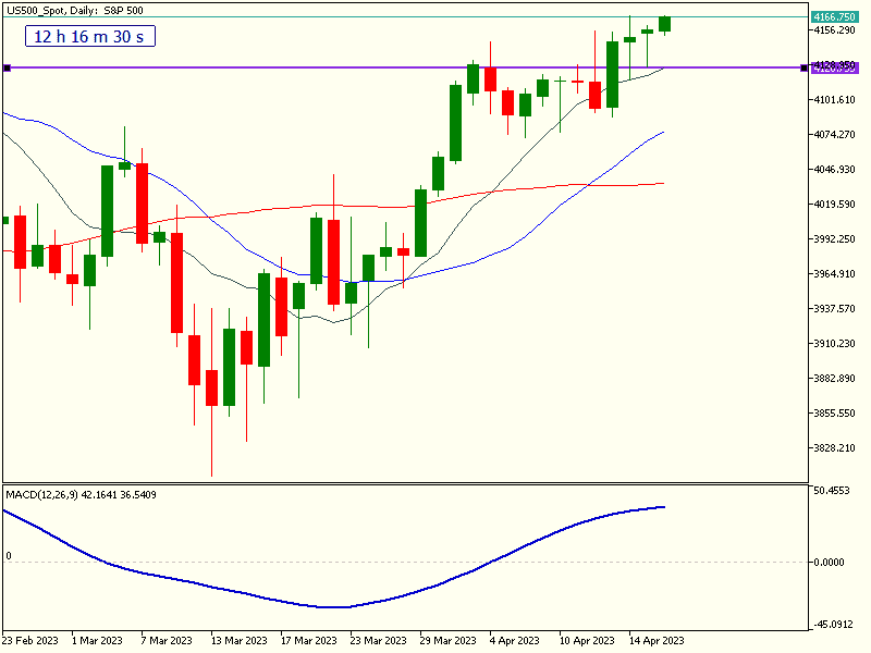
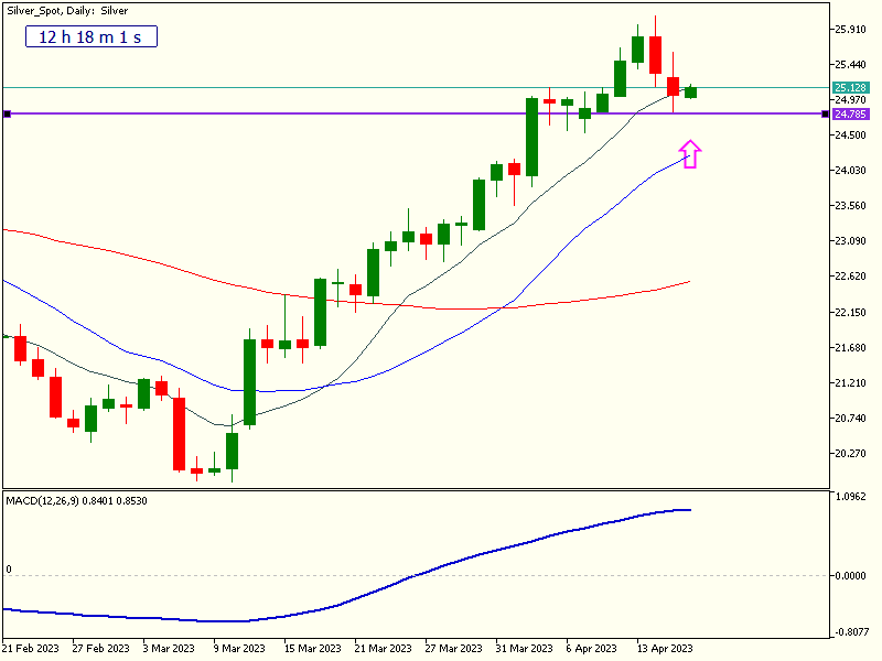
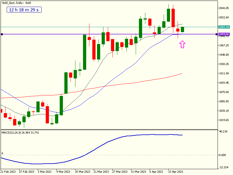
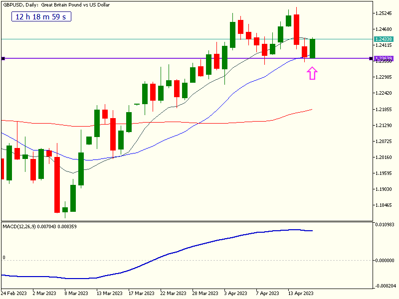
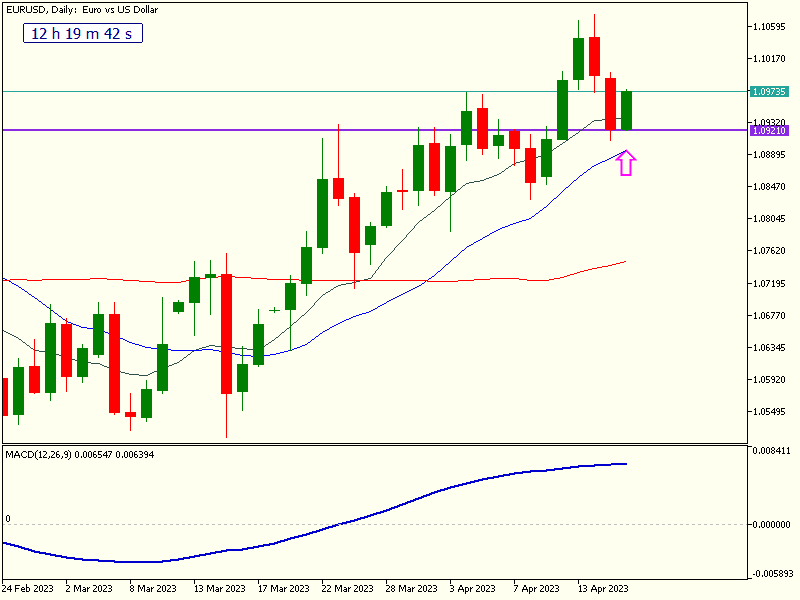
When observing an uptrend, bullish candles can be strong indicators of continued momentum, and their significance is enhanced when they align with key technical levels:
- Price Levels: These are areas where the market has previously shown strong buying or selling interest, creating support and resistance zones.
- Market Structure: The arrangement of higher highs and higher lows in an uptrend, providing a framework for understanding the market’s direction.
- Fibonacci Levels: Based on the Fibonacci sequence, these levels are considered potential support and resistance areas, where market reversals or continuations may occur.
- Pivot Levels: Calculated using previous day’s high, low, and close prices, pivot points help to identify potential intraday support and resistance levels.
- Upwards Sloping Trendlines: Drawn to connect consecutive higher lows in an uptrend, these trendlines act as dynamic support levels, reinforcing the bullish trend.
When bullish candles form around these key levels, it increases the probability of the setup, as traders collectively recognize the confluence of factors supporting the bullish move. However, it’s crucial to wait until the candle closes before acting on the signal. A candle’s final form can differ significantly from its appearance during the trading day, and prematurely acting on an incomplete signal could lead to false breakouts or reversals. So, keep an eye on these daily charts, be patient, and make informed trading decisions to stay ahead of the game.
Happy Trading!